SKINS

SKINS

Mission

The Australian sports compression wear brand SKINS is in the market since some years ago. But their traditional marketing model wasn’t taking advantage of the new digital era. This situation was making the brand mislead in a market were the possibilities are big.

We started the journey together with SKINS with the goal of increasing the sales by creating an excellent e-commerce experience starting from a “mobile first” approach.
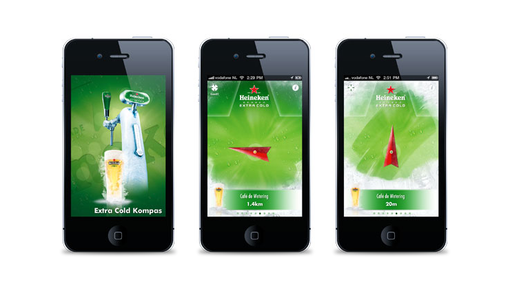
PIC HERE

Drive. Educate. Inspire.

The new concept was based in these three works: Drive, educate and inspire. Driving people using the content to generate more visits and then a bigger conversion. Inspiring them by serving them with coaching and nutrition support. And inspire them with their athletes stories and new generation and compression wear.

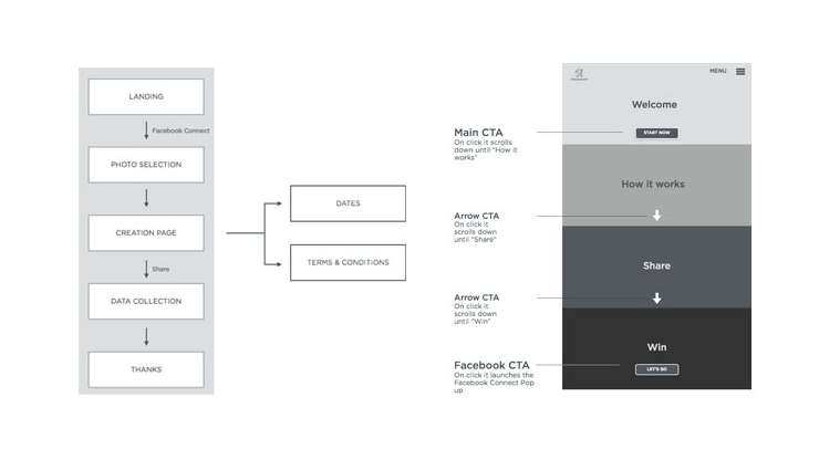
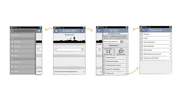
Together with the strategy team, an art director and me started researching about best practices and previous experiences and tests.

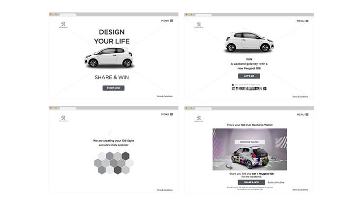
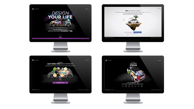
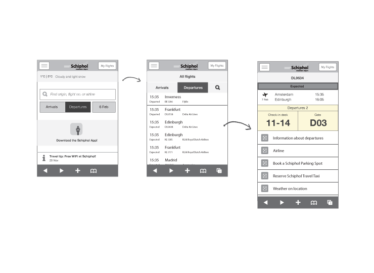
Several rapid prototyping (mainly with Keynote) and mockups were done and discussed and tested with the rest of the team. Then the visuals came to complete de vision and the experience.
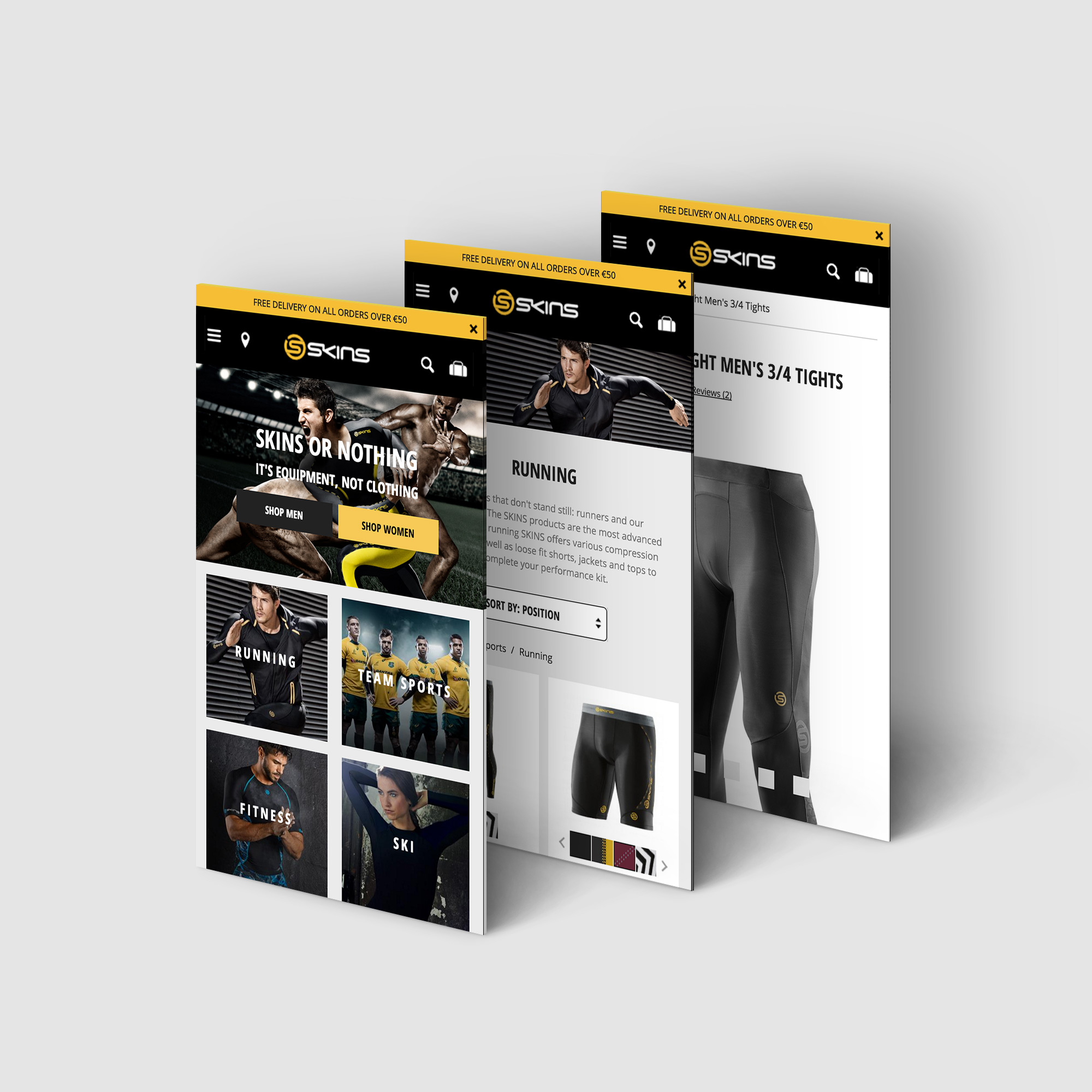
PIC HERE

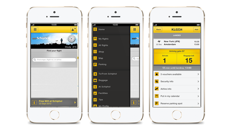
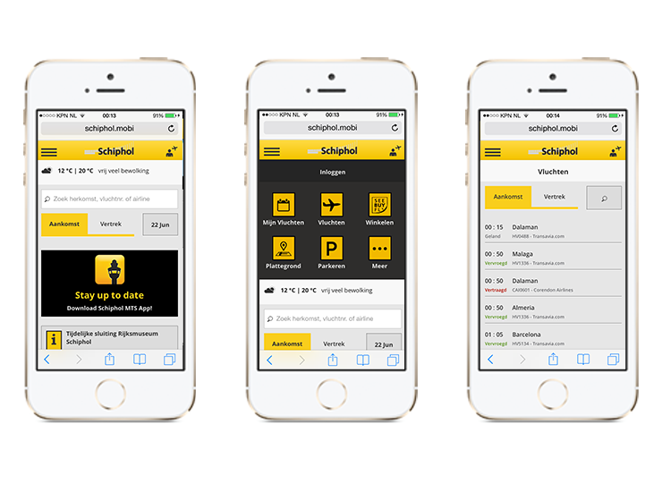
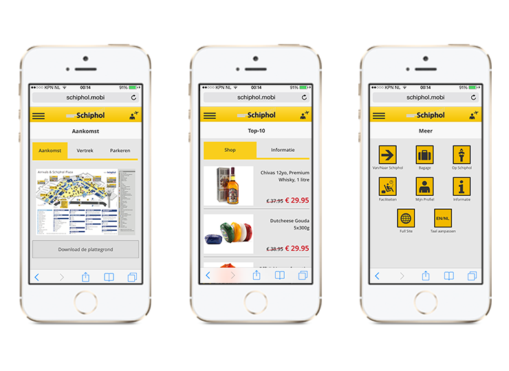
First thing made was to review and improve the information architecture, creating a simpler and better way to navigate through the site. One of the first priorities was the need for a outstanding image quality, details were very important in the product.

Home, category-landing and product page were revisited and redesign it. Introducing advance filters, ratings and a zoom functionality.

Results

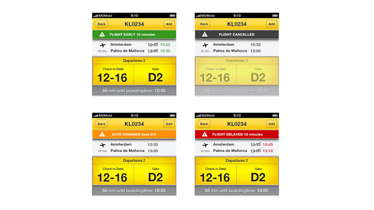
We did several in-house prototyping and during the implementation, several A/B testing were done as well.

Comparing the month of November of 2014 and 2015 we can see a revenue increase of 80% and a conversion rate up 60%.

PIC HERE

Visit SKINS site
Ahold iPad app

Ahold

Mission

The Dutch international retailer Ahold came to M2Mobi looking for ideas for a recruitment sessions they have planned: Reshaping retail. Ahold wanted to create a better experience for their next recruitment sessions. Until then they were using standard paper quizzes where the participants needed to answer every question as a team.

We transformed and gamified a simple quizzes into a successful team game that was used in the different recruitment sessions of the company.

Ahold Inhouse Day App

Process

After several meetings and brainstorming session we develop and finalise the concept. A quiz with a very special and team-powered way to answer every question.

The number of members per team is set at the beginning of the round. A serie of questions are displayed one by one, where the members of the team needed to answer individually and at the same time by taping one of the 4 options (a, b, c, d). Then a result screen with all the different answers shows up, being then the moment for the team to talk and discuss their different opinions and agree in one. Finally in the decision screen, the team choose an unique-team answer.

Ahold Inhouse Day App

The app needed to be used by the participants but also by the moderators (to reset the data for next participants), so I decided to integrate a secret gesture at the end of each game. By using the iPad’s multitouch technology we could detect all the different answers of a whole team.

Design

Following the Ahold guidelines and keeping in mind the “game feeling” we wanted to have, I end up with a clean, branded and gamified design that was a success.

Ahold Inhouse Day App

See the photo gallery of the event

Nomads Agency

Nomads Agency redesign

Mission

While working at the just founded by then Nomads Agency, we needed to upgrade the company website and create a proper experience in line with the new branding and philosophy. The goal was create a new site that quickly engages and creates the best impression at glance.

Process

Together with a whole team we started to research and compile the best in class around the web. We differentiate several elements that were a must be at the site, like full screen images together with clear Call to Actions and a seamless journey.

I started to mockup the homepage, where I decided to apply a little bit of parallax for the main projects showcase. For that I build a quick prototype using HTML5, Javascript and CSS3 in order to have an idea of how it feels and show to the rest of the team the interaction.

There were several interactions and reviews with most of the colleagues, but everybody got involve and happy with the initial mockups and sketches.

Nomads Agency wireframes

The prototype really helped to everyone and specially the developers to understand the flow and how the different slides were covering up the previous ones. The rest of animations came later during the design and first demos.

Design

The design came by the senior designer Kim Hoffenberg, with who I worked very close during all the project.

Nomads Agency design

Visit Nomads Agency site

Peugeot - Design your life

Design your life

Mission

The new Peugeot 108 has been recently launched in The Netherlands together with the Design Your Life campaign. It was needed a activation that perfectly matched with the new car.

We created the concept and Facebook was the way to go. We moved away of the classical Facebook app and went into a more Facebook Connect Site, removing with this all the limitations that the first option has.
Design Your Live allows you to show yourself in the new 108 and win a Peugeot 108 for a weekend.

Experience

The campaign site needed to be easy and accesible from any device. I defined a 3 steps journey: Connect -> Create -> Share as a core of the experience. A journey that serves the business goal and the user experience.

Peugeot - Design your life

The introduction screen drives the user through the instructions, ending with a clear call to action to Connect with Facebook. Your most popular photos are selected and shown. Here I have included a “shuffle” option to still give a bit of control to the user, who can click and get other set of images.

Then the 108 is rendered with the user’s pics. A 108 that is possible to move and turn around to see all your pictures.

Process

I made the wireframes and rapid prototype in Keynote. This was a first and great experience using Keynote as a UX tool. I could represent and define most of the animations of the site.

Peugeot - Design your life

A clickable PDF and a more accurate prototype in Axure were presented to the client and used for the developers for the implementation.

The prototype really helped to everyone and specially the developers to understand the flow and how the different slides were covering up the previous ones. The rest of animations came later during the design and first demos.

Design

Peugeot - Design your life

Results

Once the campaign ended, we measured three different areas and we saw great results: +24% awareness, +3% test drive bookings and +45% encouragement of Facebook Likes.

Note: This campaign ended in 2014. The website isn’t live anymore 🙁 Sorry for any inconvenient.

Schiphol App

Schiphol MTS App 2.0

Mission

One of the most important airports of Europe deserves a fresh and attractive app to help their travelers. The previous experience was obsolete and needed to be improved.

Schiphol App 2.0

Process

We differentiated the necessities of the different users/personas like travelers or taxi drivers, and prfioritize screens and features in order to get the best experience for all the users.

A side-drawer (or hamburger) solution was chosen, due the big amount of information and menu items we had. Obtaining in this way, an always-direct access to every section. One of the most notable improvements was the right-side drawer for My flights, giving the access to the upcoming saved flight by swiping to the left at any moment.

Schiphol App 2.0

All kind of details were defined very carefully, like all the different styles and colours for the flight status or the simulation of the Schiphol signs for the flight details screen. Every detail counts to offer the best experience.

Schiphol App 2.0

The prototype really helped to everyone and specially the developers to understand the flow and how the different slides were covering up the previous ones. The rest of animations came later during the design and first demos.

Another special release together with this 2.0 version was the app for Windows Phone. It was the beginning of this OS so there were not too many guidelines or experience around. Even though we create a native Windows Phone experience that kept the Schiphol feeling.

Schiphol App 2.0 Windows Phone

Design

Following guidelines and close to the rest of the team, either designers and developers, we went for a more fresh yellow and grey colors, moving away from the previous dark and glossy design.

Schiphol App 2.0

Note: The app for iOS and Android has been redesign in the last years. The interaction remains the same but the visual design has been refreshed according with the Schiphol guidelines.

Schiphol Amsterdam Airpot for iOS

Schiphol Amsterdam Airpot for Android

Schiphol Amsterdam Airpot for Windows Phone

UT - The ship that launched a thousand stories

UT – The ship that launched a thousand of stories

Mission

We created a platform, “The Ship that Launched a Thousand Stories”, to celebrate the 40th anniversary of the UT model by sharing stories and experiences of the marine community.
The platform is also a place where the community can submit their own UT experience and start a conversation with the Rolls-Royce Marine team.

The platform needed to be easy and intuitive. And the content is leading the site. After defining personas and target group, a solid information architecture of the site was defined, organising the site in 4 areas: Explore, Live Map, Design System and Ask us. Covering the needs and fulfilling objectives of engaging and conversations starter.

UT

Several interviews were made and shouted along the North sea and Mediterranean sea, providing a rich and engaging ongoing collection of stories around de famous vessel. We also introduced a Live Map where its possible to see the current location of the UT vessels around the world as well as the future ones.

UT – The ship that launched a thousand of stories

Process

Starting by defining the business goals of the campaign, we started to design the estructure and main journeys of the site. A clear sitemap came first and then I start to sketch the possible layout.

I made full detailed wireframes for desktop and mobile using Omnigraffle and Photoshop. And provided a prototype of how the responsiveness needed to act on the background header image based on Foundation framework.

UT – The ship that launched a thousand of stories

UT – The ship that launched a thousand of stories

Design

UT – The ship that launched a thousand of stories

Note: This campaign already ended and the site isn’t live anymore 🙁   Sorry for the inconvenience

Schiphol Mobile Web

Schiphol Mobile Web

Mission

The mobile site of Schiphol is used almost as much as the app. Its speed, simplicity, functionalities and compatibility with all the mobile browsers make of he site a very powerful tool for all the publics.

The site needed a refresh in order to improve the experience and to be inline with the app.

Schiphol Mobile Web

Process

Thinking in the performance improvement of the site, I removed most of the images (keeping only the most necessary) and defined CSS styles and elements as much as possible. I also created an custom icon-font, which allowed us to not depends of several images sizes to cover properly all the new HD and retina screens.

Fully detailed wireframes were created using Illustrator and Photoshop, focusing in all the red routes of the site and improving them.

Schiphol Mobile Web

Design

Most of the design is based in flat colors (oposite than the app) and using CSS and icon-font. I worked very close to the developers in order to get a proper result and experience.

Schiphol Mobile Web

Visit Schiphol.mobi site

Heineken Extra Cold

Heineken Extra Cold Compass

The Compass

An idea that came from Heineken and we transformed it and shaped it into a visual and simple stunning app. Together with a Heineken Extra Cold Campaign and several promotions in all kind of bars around the country, the app for iPhone and Android told you where to go in the most classic way: by using a compass.

Together with the compass, a map was giving a bigger view of all the possibilities to get a Extra Cold beer.

Design

Always with the Heineken guidelines next to me, I designed a compass that was getting more and more frozen the closer you got to the bar. Until the screen just freeze completely, which means you just arrive to the right place to get your beer.

Heineken Extra Cold