Mission
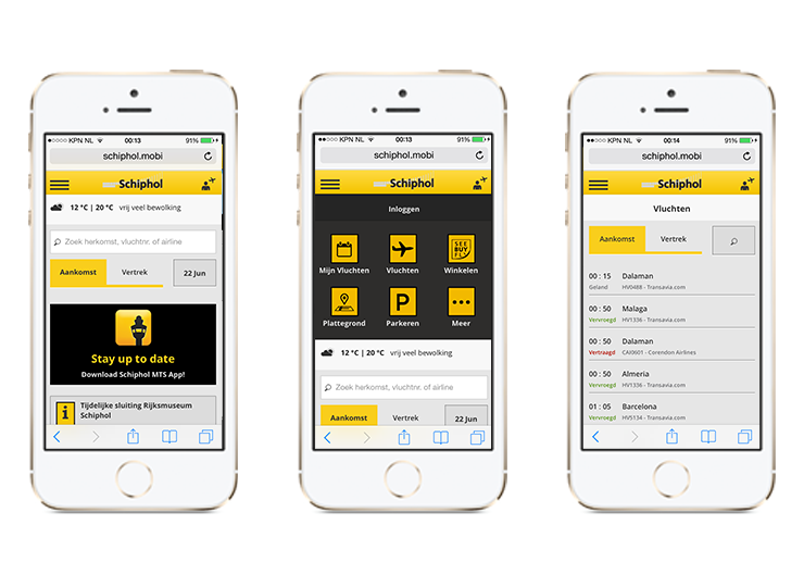
The mobile site of Schiphol is used almost as much as the app. Its speed, simplicity, functionalities and compatibility with all the mobile browsers make of he site a very powerful tool for all the publics.
The site needed a refresh in order to improve the experience and to be inline with the app.

Process
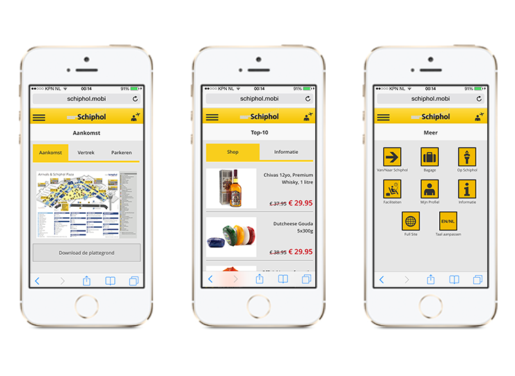
Thinking in the performance improvement of the site, I removed most of the images (keeping only the most necessary) and defined CSS styles and elements as much as possible. I also created an custom icon-font, which allowed us to not depends of several images sizes to cover properly all the new HD and retina screens.
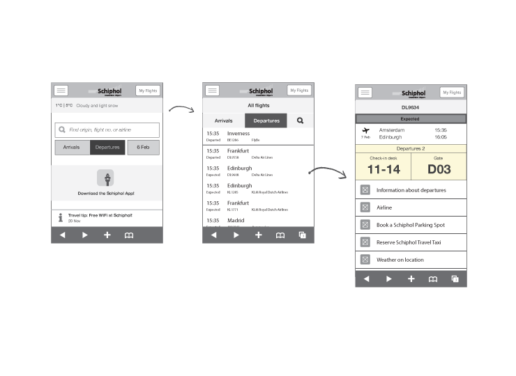
Fully detailed wireframes were created using Illustrator and Photoshop, focusing in all the red routes of the site and improving them.

Design
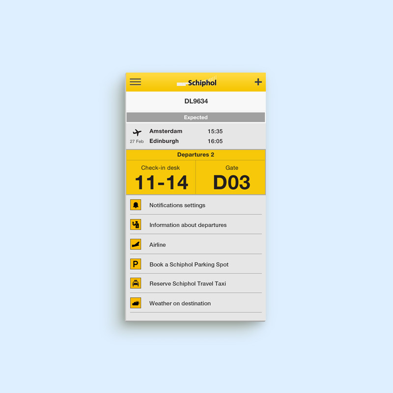
Most of the design is based in flat colors (oposite than the app) and using CSS and icon-font. I worked very close to the developers in order to get a proper result and experience.

