Mission
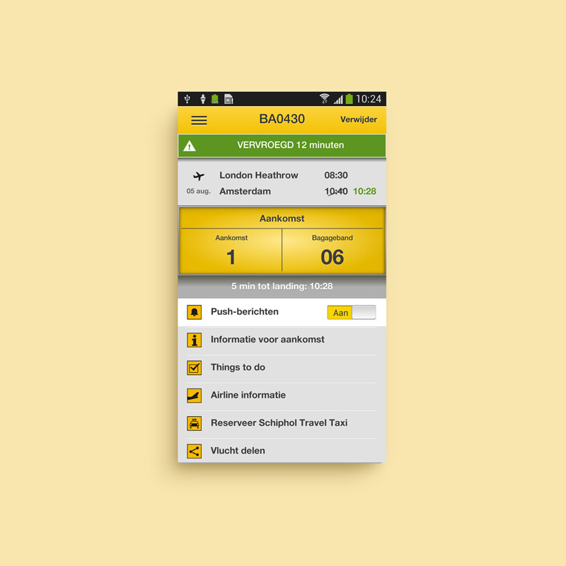
One of the most important airports of Europe deserves a fresh and attractive app to help their travelers. The previous experience was obsolete and needed to be improved.
Process
We differentiated the necessities of the different users/personas like travelers or taxi drivers, and prfioritize screens and features in order to get the best experience for all the users.
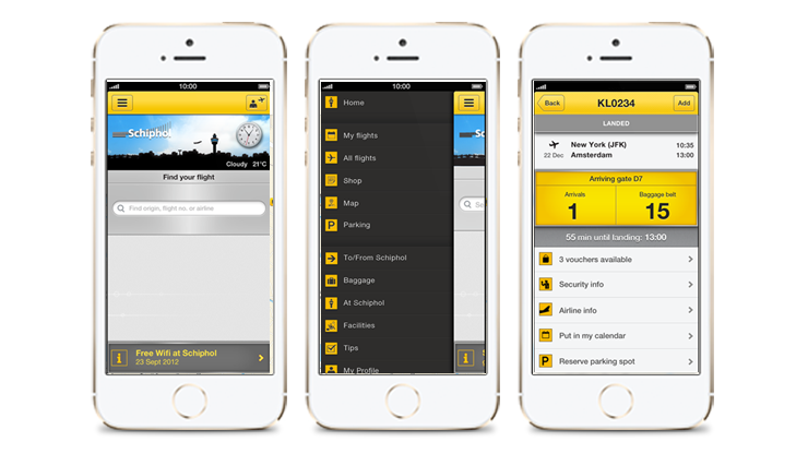
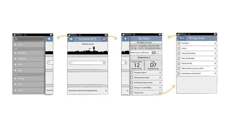
A side-drawer (or hamburger) solution was chosen, due the big amount of information and menu items we had. Obtaining in this way, an always-direct access to every section. One of the most notable improvements was the right-side drawer for My flights, giving the access to the upcoming saved flight by swiping to the left at any moment.
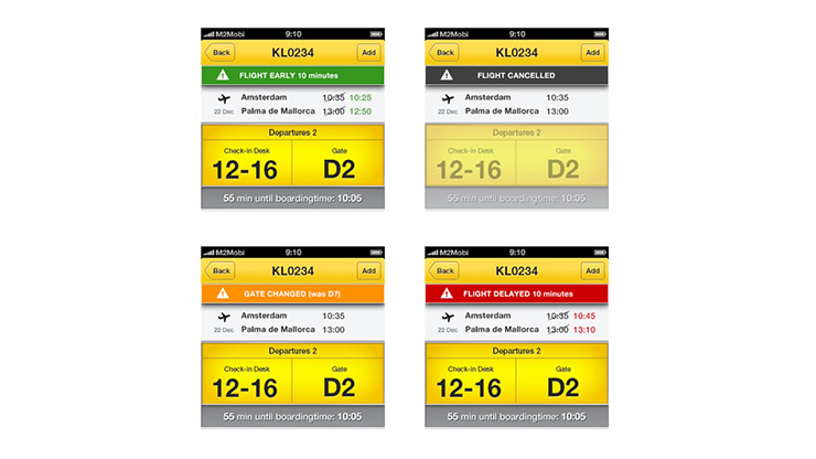
All kind of details were defined very carefully, like all the different styles and colours for the flight status or the simulation of the Schiphol signs for the flight details screen. Every detail counts to offer the best experience.
The prototype really helped to everyone and specially the developers to understand the flow and how the different slides were covering up the previous ones. The rest of animations came later during the design and first demos.
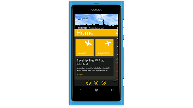
Another special release together with this 2.0 version was the app for Windows Phone. It was the beginning of this OS so there were not too many guidelines or experience around. Even though we create a native Windows Phone experience that kept the Schiphol feeling.
Design
Following guidelines and close to the rest of the team, either designers and developers, we went for a more fresh yellow and grey colors, moving away from the previous dark and glossy design.
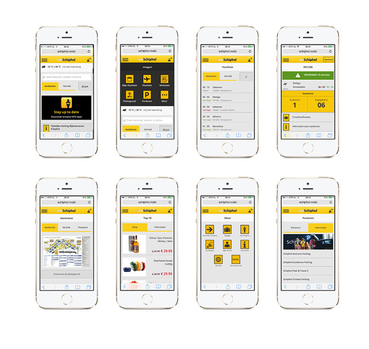
Note: The app for iOS and Android has been redesign in the last years. The interaction remains the same but the visual design has been refreshed according with the Schiphol guidelines.
Schiphol Amsterdam Airpot for iOS
